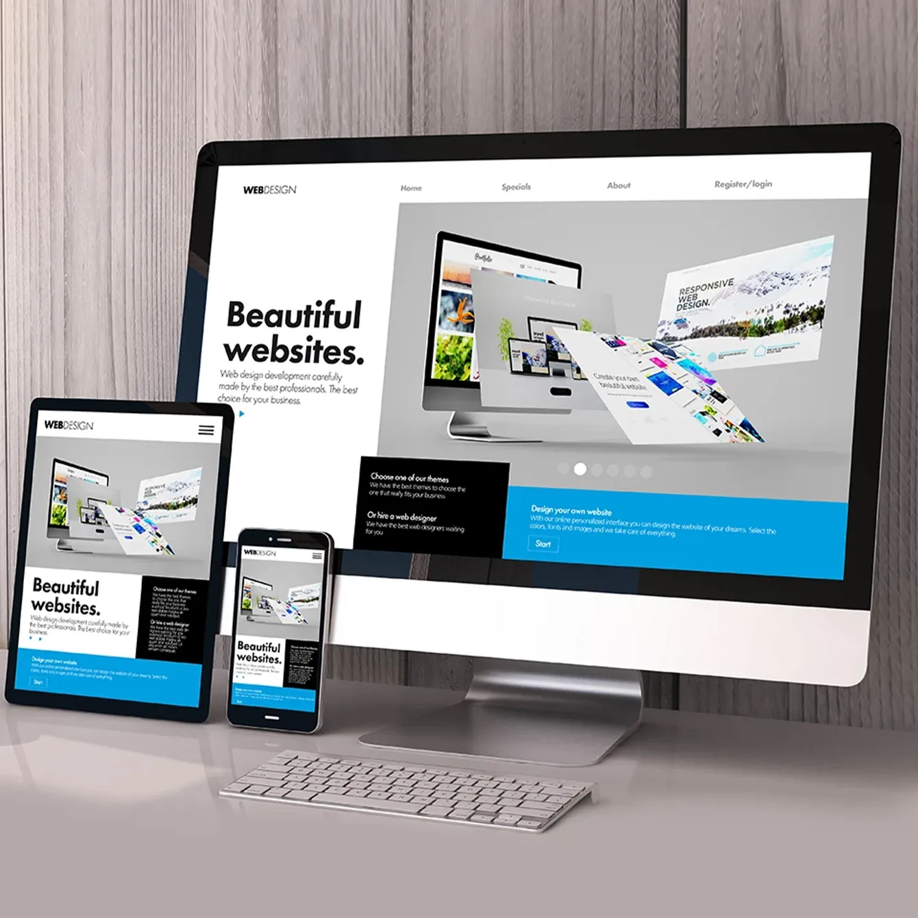
There are thousands of pre-built website templates available out there, and developers designing many new sites every day. And if you’re looking for the best website templates to make your users browsing experience better, then this article is dedicated to you.
In order to narrow down the selection, we have created this article to make your selection of mobile-first design better and beneficial.
To initiate the selection process, follow these basic selection steps:
- Identify your business niche and website requirements first.
- Explore more web design templates and learn more from your competitors.
- Analyze the whole designing elements and consider mobile first-design in your mind.
- By using a problem-oriented approach to choosing a UI template, you prevent choosing a just fashionable model. While many UI templates have gained popularity, you shouldn’t base your web design on something that’s just trending.
Think about how you can help users achieve specific goals with your web design services, then start looking for the most effective templates for web design in Melbourne.
A step-by-step, hands-on framework
Let’s see the web design company process in action with the following example: you notice that many of your users do not subscribe when they browse your site.
- Identify the problems of your site
Since users still visit your page and spend a corresponding amount of time there, you can conclude that the problem is related to the login and registration processes. The solution is to simplify both processes in such a way that users do not object to them.
- Explore more web design templates and learn more from your competitors
You decided to become a detective for a while and visit some popular sites like yours. Some people use automatic account creation, but this does not solve the problem of enticing users to sign up or sign in. Some others use incentives such as additional features or more content, but that doesn’t fit the style of your particular site.
Finally, you will notice that some sites use social media authentication, which allows them to log in or register with their pre-existing accounts. This sounds like a good solution to your problem and goes well with the calm style of the site.
- Check how other sites are using these templates
You take a close look at the big sites like Spotify, Pinterest, Wunderlist and see how they use social registration/login. You even visit sites unrelated to yours, in case something there inspires you. If you’re a developer, check out other designing factors too. Analyze how others sites are using these templates and do something that no one is doing. It will allow you to explore your creativity and help you make your website mobile-friendly.
- Analyze templates and choose the elements that suit you
You will notice that different sites offer different social media outlets like Twitter, Google or LinkedIn – but every site includes Facebook. Sometimes the options are set out with text (“Login with Facebook”), and in other cases, the icon is located near the registration form so that you understand its purpose.
Remembering the Gestalt principle of how proximity implies function, you decide that icon buttons are enough. After all, social registration is popular, and your users most likely know that these buttons mean they can sign in with their social media accounts. You chose to include Facebook, Twitter and Google because they are the most used on the sites you viewed, and you rank Facebook as the most popular option.
Don’t get too attached to it once you’ve found an effective UI template, although UI templates are wonderful for consistency. For example, you are designing a website with viral content, and you decide that infinite scrolling is the best way to make all the content accessible. After all, you have seen many other sites using it with great success.
While infinite scrolling can make a better impression than forcing users to click the “next page” button every ten articles, it may not be the best solution. You can only figure it out by brainstorming, wireframing, prototyping, and testing.
Treat UI website templates as a “safe zone” for consistency, and sometimes allow yourself to get creative outside of it. Know the patterns, respect the patterns, but start your design with a fresh look every time. And your design will remain familiar, with the ability to become something new.
Output
Good design will delight your users and motivate them to visit your site again and again; they will have a sense of closeness with you. But these seemingly natural aspects are achieved with a lot of effort and know-how that will give this “natural” feeling. Templates are a tool for this, and knowing how to use them means knowing how to create the illusion of “naturalness.” Especially when you’re looking for perfect mobile-first design websites for your business, let me know if you find this article informative and useful enough for creating your website. Comment below!

Ravi is a digital entrepreneur who has a vision of helping businesses to increase their online presence through websites, mobile applications, and SEO. He is the Founder & CEO of Webomaze Pty Ltd, a one-stop digital agency based in Melbourne.


Leave a Reply