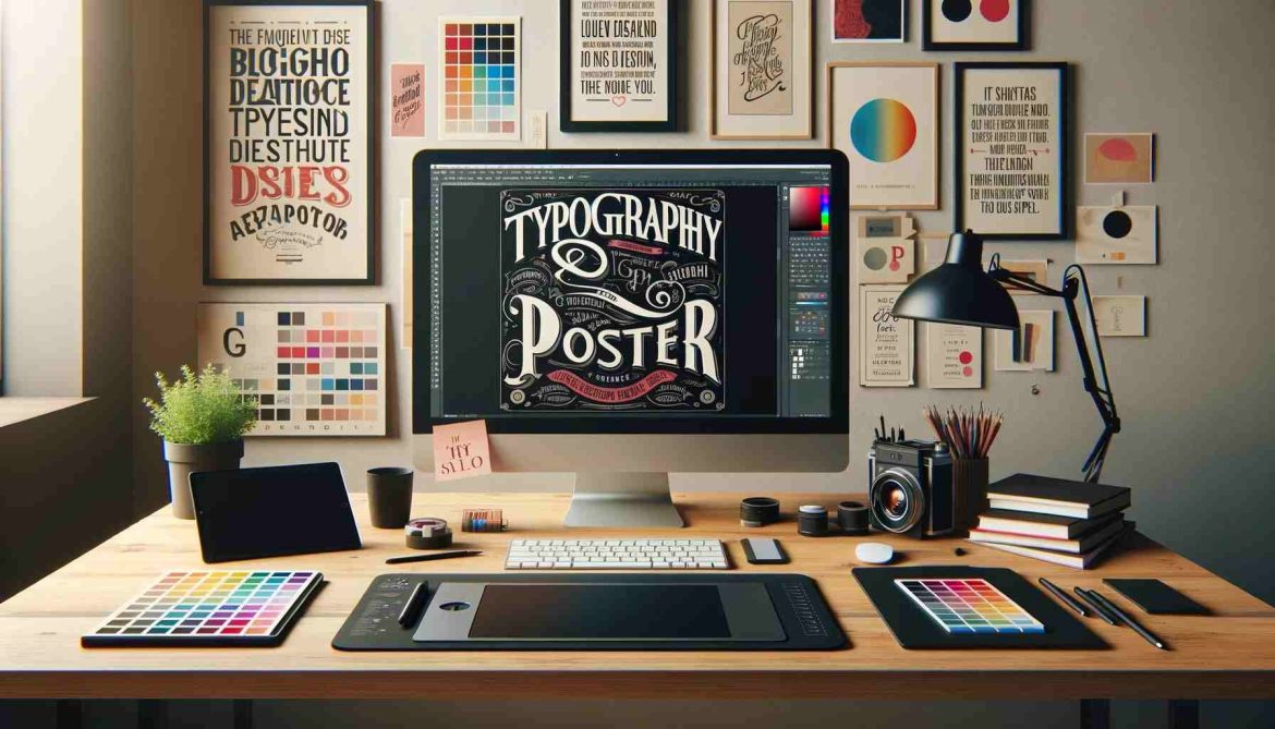
Typography posters have evolved into an effective way to convey messages, capture viewers’ attention, and show creativity in this digital age. Typography poster, which allow designers to experiment with different fonts, colours, and layouts to create visually stunning pieces that appeal to the audience, have taken on a new life due to the rise of social media and online platforms.
In this post, we will discuss the evolution and power of typography posters, tips for creating posters, and the necessary steps to develop eye-catching typography posters.
Evolution of Typography posters
Typographic posters have a long tradition, dating back to the early days of printing presses with movable type. But now, with the advent of Digital Technology, designers have a wealth of tools that allow them to create dynamic and striking typographic designs. To develop distinctive posters that appeal to a wide variety of users in the saturated Digital landscape, designers can easily manipulate text and experiment with various font types and colour schemes from Adobe Illustrator to Canva.
The power of typography
Typography isn’t just about choosing a font; it’s about writing words on a page. This is about creating a visual hierarchy, establishing a tone, and eliciting an emotional response from the viewer. Typography is crucial in drawing attention, conveying information and making lasting impressions when designing posters. The message can be communicated quickly and effectively, drawing viewers in and stimulating curiosity through a well-designed typography poster.
Tips For Creating Eye-Catching Typography Poster
- Choose the right font:
To create a good typography poster, select an appropriate font. Think of the message that you’d like to convey and your tone. If you want a font that will appeal to your audience, experiment with other fonts.
- Play with colour
Colour can bring about feelings, attract attention, and improve readability. A colour scheme that complements your font choice and matches the overall feel of this poster is used.
- Be careful with the layout.
The layout of the typography poster is crucial to its success. Think about the placement of text, use of negative space, and a general design balance. If you can’t find one that’s visually appealing and easy to read, play around with different schemes.
- Experimenting with effects
designers can apply effects such as shadows, gradients and textures to their typographic posters through the use of Digital Tools. These effects may enhance your design’s richness and depth, which makes it more visually attractive.
- Make it easy
Simplicity is the key in today’s Digital Age, where attention spans have shortened. Don’t add unnecessary elements to your typography poster. Look at what you want to say and let the font make its statement.
- Limit Your Fonts:
Stick to a few fonts to maintain consistency and avoid a chaotic look.
- Use Typography as Art:
Think of your typography as art and get creative with your design.
- Get Inspired:
Look for inspiration from other typography posters to spark your creativity.
- Seek Feedback:
Get feedback from others to help you refine and improve your design.
- Print in High Quality:
If you plan to print your poster, use high-quality materials for the best results.
- Consider Your Audience:
Tailor your typography poster to appeal to your target audience.
- Stay Consistent:
Maintain consistency in your design elements to create a cohesive and professional-looking poster.
- Have Fun:
Most importantly, have fun with the process and let your creativity shine through in your typography poster.
Steps for Creating a Typography Poster
Creativity, strategic planning, and attention to detail are needed to create a typography poster that catches the eye and effectively communicates the message. The basic steps of the production of a visually appealing and powerful typography poster are as follows:
1. Define the Purpose and Audience
- Identify Key Objectives: Clearly outline what you want to achieve with your poster. Is it to inform, persuade, or entertain? This will guide all your subsequent design decisions.
- Research Your Audience: Understand the demographics and preferences of your audience. What is their age range? What cultural, social, or professional contexts might they be coming from? Tailoring your design to fit your audience can significantly increase its effectiveness.
2. Choose Your Message
- Clarity and Brevity: Keep your core message clear and concise. A good rule of thumb is that someone should be able to understand the poster’s main message in a few seconds.
- Call to Action: If applicable, incorporate a solid call to action. Tell the audience what you want them to do after viewing the poster.
3. Select a Suitable Typeface
- Emotional Impact of Typefaces: Different fonts evoke different emotions. For instance, serif fonts can appear more traditional, while sans-serif fonts are modern.
- Font Legibility: Ensure the font is easily read, even from a distance. Avoid overly decorative fonts that might reduce legibility.
4. Plan Your Layout
- Visual Hierarchy: Arrange text in a hierarchy of importance. Use size, color, and placement to guide the viewer’s attention to the most critical parts first.
- White Space: Don’t be afraid to use white space (space). It can help prevent your poster from cluttering and make your message stand out.
5. Experiment with Typography Techniques
- Creative Text Arrangement: Consider text shapes and paths that can add interest. For example, arranging text in a circle or following a dynamic curve.
- Layering and Contrast: Use contrasting typeface weights and colours to create depth and emphasis.
6. Add Color and Texture
- Psychology of Colors: Choose colours based on the emotion or action you want to evoke. For example, blue can convey trust and stability, while red can invoke excitement.
- Consistency: Use a consistent colour palette that reflects your brand or message.
7. Incorporate Visual Elements (Optional)
- Supportive Imagery: Use images or graphics that support or enhance the textual message. Ensure these elements are integrated harmoniously with the text.
- Balance: Keep a balance between text and imagery. The text should always remain the star in typography posters.
8. Ensure Readability from a Distance
- Test Different Distances: Print a prototype of your poster and test it by viewing it from different distances to ensure the text is readable and the layout is visually appealing.
9. Get Feedback
- Diverse Perspectives: Show your design to people from different backgrounds to get various opinions.
- Iterative Design: Be open to making multiple iterations based on the feedback. Sometimes, minor tweaks can make a big difference.
10. Finalize and Test
- Pre-Printing: Check for any spelling errors or alignment issues. Ensure the resolution and dimensions are suitable for printing.
- Environment Testing: Consider where the poster will be displayed and observe how lighting conditions affect visibility.
Conclusion
In the digital age, typography posters remain a powerful and flexible medium for designers to express their creativity, convey messages, and connect with audiences. The designers can produce eyepopping posters that draw attention and make them memorable by experimenting with fonts, colours, patterns or effects. Think about the power of a typography poster in this digital age next time you want to say something or promote an event.
It’s the art of combining text, design and strategy to create a typography poster. To ensure that the final product draws attention and effectively communicates its intended message, each step of the process is crucial. Your typography poster may stand out and have a lasting effect with careful attention to detail and creative execution.